Creative direction // BRAND IDENTITY // digital design
Brand Refresh

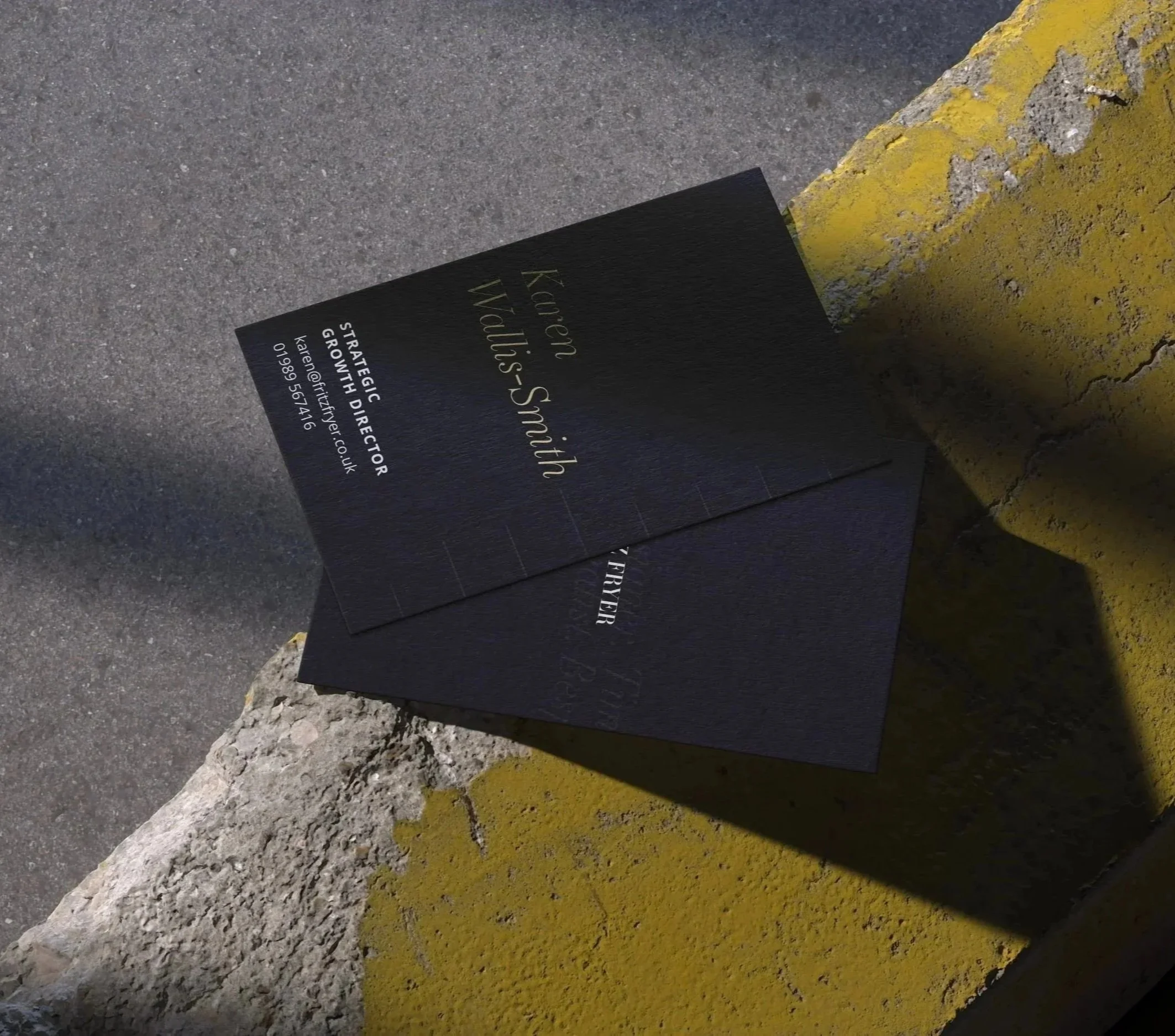
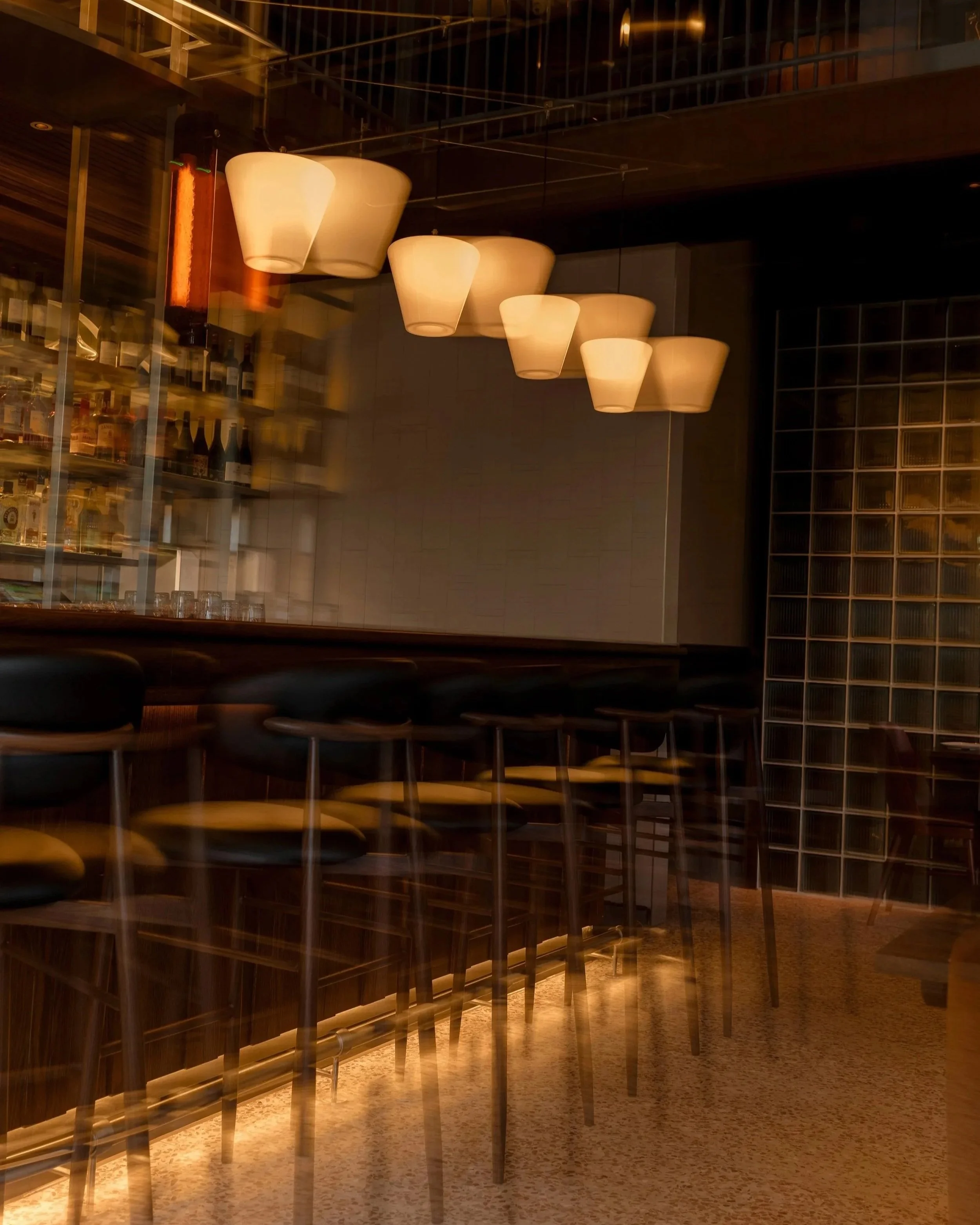
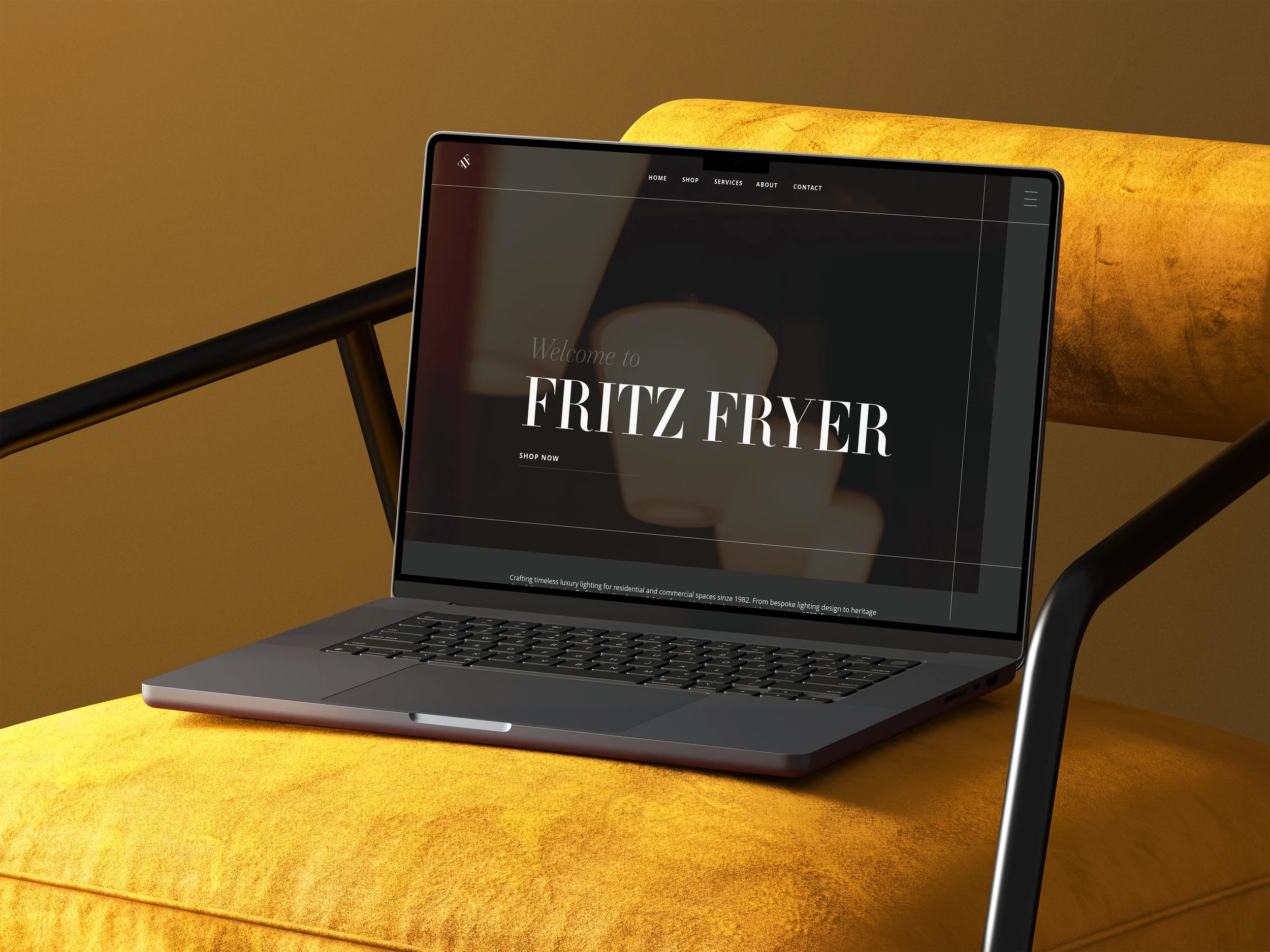
Fritz Fryer set out to refresh their brand while honouring their heritage. The aim was to modernise the identity, creating a more cohesive and contemporary look that still reflects their reputation for craftsmanship and quality.
we refined:

brand story:
typography:

ESSONNES DISPLAY LIGHT ITALIC :

I introduced Essonnes DISPLAY LIGHT ITALIC as an accent font to bring a lighter, more refined contrast to the branding. Its elegant forms soften the overall typography, reducing harshness while adding nuance and detail. This subtle shift enhances the sophistication of the brand identity and provides flexibility across applications.
Fritz Fryer Lighting blends heritage craftsmanship with contemporary design. Known for its meticulous attention to detail and quality materials, the brand creates lighting that feels both timeless and modern, offering pieces that elevate interiors while telling a story of tradition and innovation.
colours:
application: